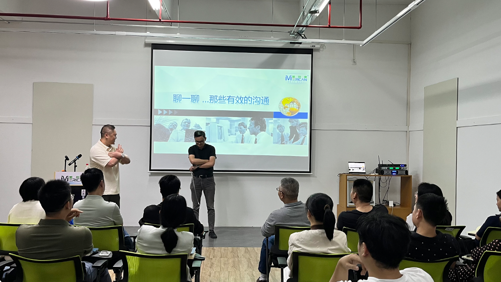
Al fine di visualizzare meglio l’immagine del Gruppo Merican e rafforzare ulteriormente l’influenza e il riconoscimento del marchio del Gruppo, Merican ha recentemente lanciato ufficialmente un nuovo logo, che non è solo un aggiornamento fondamentale del marchio, ma significa anche che Merican è entrata in una nuova fase di sviluppo strategico globale!

Nuovo logo Mericano| Trasmettere il cuore dell'azienda
Il nuovo LOGO di Merican non porta solo il distillato dello spirito della cultura aziendale del passato 16 anni di pratica commerciale, ma dimostra anche l’incessante ricerca di Merican verso il futuro dell’esplorazione scientifica e tecnologica e la passione per l’innovazione, così come il suo impegno per diventare uno dei principali gruppi internazionali nel settore della bellezza e della salute, potenziare la globalizzazione della scienza e della tecnologia per una vita sana e migliore.
{ Interpretazione della proposta di valore di “bellezza e salute”. }
Rispetto alla vecchia versione del logo, la nuova versione del logo mantiene lo stile tipografico originale, e il design complessivo è ottimizzato con caratteri arrotondati e piatti, che è più energico e presenta il senso estetico sia di rigidità che di flessibilità; l'elemento carattere di “Mericano” è posizionato in alto, che interpreta vividamente la proposta di valore di MERACAN relativa allo shaping “bellezza e salute”. –La salute è la cosa più importante, e la bellezza della salute è la vera natura della bellezza.
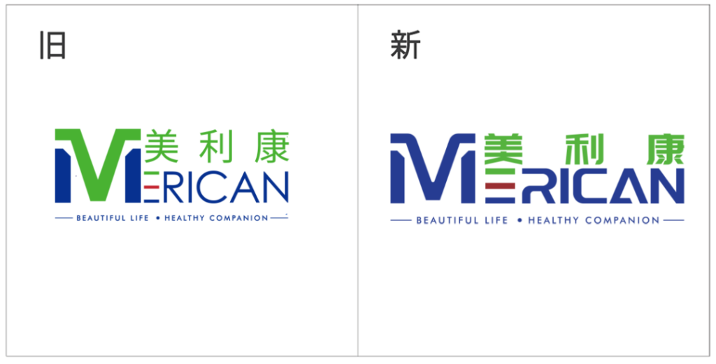
▲ Confronto tra vecchi e nuovi loghi
{ Fornire le basi innovative di “La qualità prima di tutto”. }
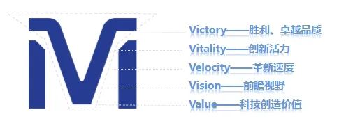
Tra loro, IL “M” L'elemento simbolo non è solo la lettera iniziale di Mericom, ma unifica anche i colori sotto forma di un picco di montagna, il che implica che la qualità di Mericom è stabile e affidabile come le dolci vette delle montagne.
Allo stesso tempo, il taglio dinamico del simbolo gli conferisce un collegamento tra “M” E “V”, che simboleggia la vittoria, qualità superiore (Vittoria), vitalità innovativa (Vitalità), velocità innovativa (Velocità), visione lungimirante (Visione), scienza e tecnologia per creare valore (Valore), e così via, e rappresenta la posizione leader di Mericom nel campo della ricerca scientifica e la ferma fiducia nella ricerca e nella scoperta scientifica. Vitalità
{ Trasmettere il concetto fondamentale di “People First”.}
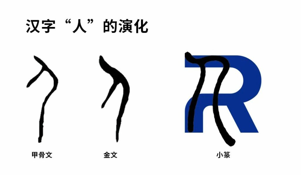
IL “R” E “UN” anche i simboli sono stati ridefiniti. IL “R” deriva dalla forma del carattere cinese “persone” nella scrittura del sigillo, che trasmette fortemente la filosofia di sviluppo di Miracon “orientato alle persone”. IL “R” è anche rotto per esprimere lo spirito innovativo di Miracon di superare costantemente se stesso e di osare fare scoperte nel corso dello sviluppo.
Allo stesso tempo, “R” può essere suddiviso in 2 n, il che significa n volte, implicando le possibilità illimitate di Mericom in futuro, e il concetto di Mericom che diventa sempre più forte come gruppo aziendale globale che abbraccia i campi della bellezza, salute, cure mediche, sport e altre industrie diversificate.
La forma di “UN” è come un raggio di luce rifratto che sale lentamente verso l'alto, che rappresentano l'energia luminosa e riflettono gli attributi del marchio e il posizionamento di Mericom. Allo stesso tempo, come la piramide immortale, simboleggia il duro, atteggiamento stabile e ascendente di Mericom, e dimostra anche che Mericom protegge sempre la fiducia di ogni cliente con prodotti e servizi professionali sicuri e stabili.
{ Per dimostrare la nostra missione di “Illuminando bellezza e salute”.}
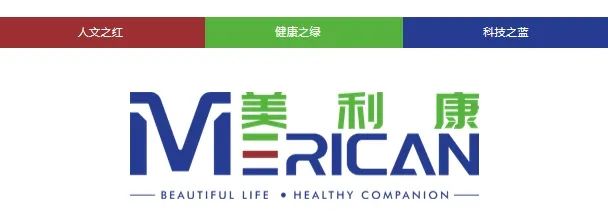
Il nuovo logo di Merican eredita l’intento originale e continua i tre colori primari altamente riconoscibili del marchio: verde, che rappresenta la vitalità della salute; rosso, che significa luce e speranza; e blu, che simboleggia la vitalità e l'innovazione, scienza e tecnologia. Tuttavia, la differenza è che il nuovo logo si basa sul colore blu, che dimostra pienamente al mondo esterno che Merican si sta trasformando in un marchio con la missione di “Illuminare la luce della scienza e della tecnologia, La bellezza e la salute illuminanti”.
Mericano apre ufficialmente una nuova era del branding | Creazione di una nuova matrice di marca
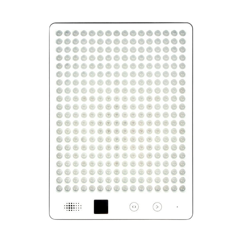
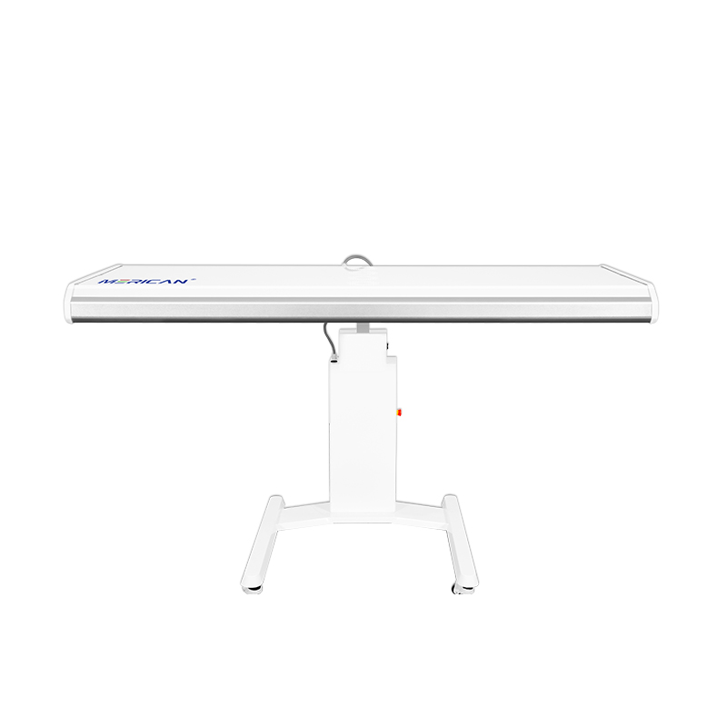
Dalla sua fondazione nel 2008, Merican ha sostenuto la pratica e l'innovazione, e plasmare costantemente il proprio marchio. Ha formato una base e un sistema stabili nei campi di R&D, produzione, marketing e assistenza dalla macchina alle periferiche, e i suoi marchi sono molto amati dai clienti in patria e all'estero. Il rilascio del nuovo LOGO aprirà una nuova era per la strategia del marchio Merican.
Come un nuovissimo marchio tecnologico, il nuovo LOGO Merican sarà esteso a vari campi come l'applicazione aziendale e la costruzione della cultura del marchio, fornire agli utenti prodotti e servizi di migliore qualità e creare più valore per i clienti.