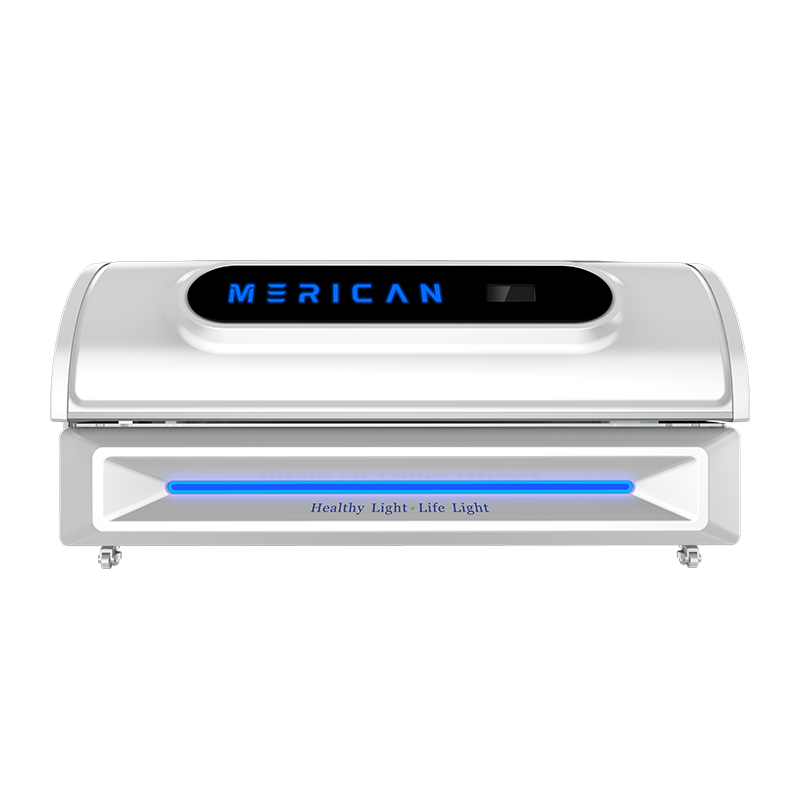
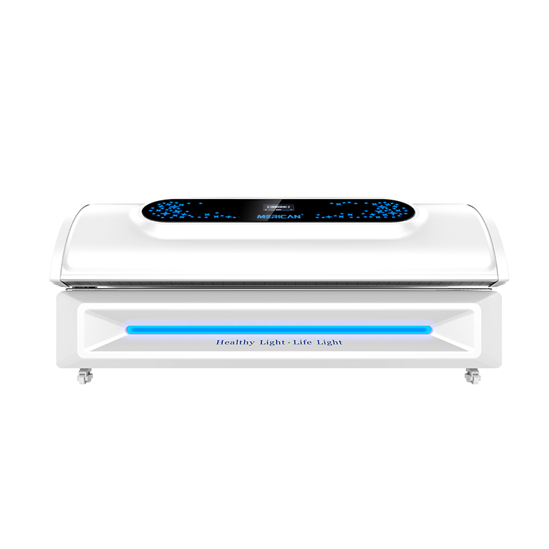
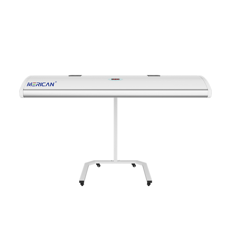
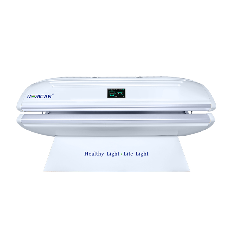
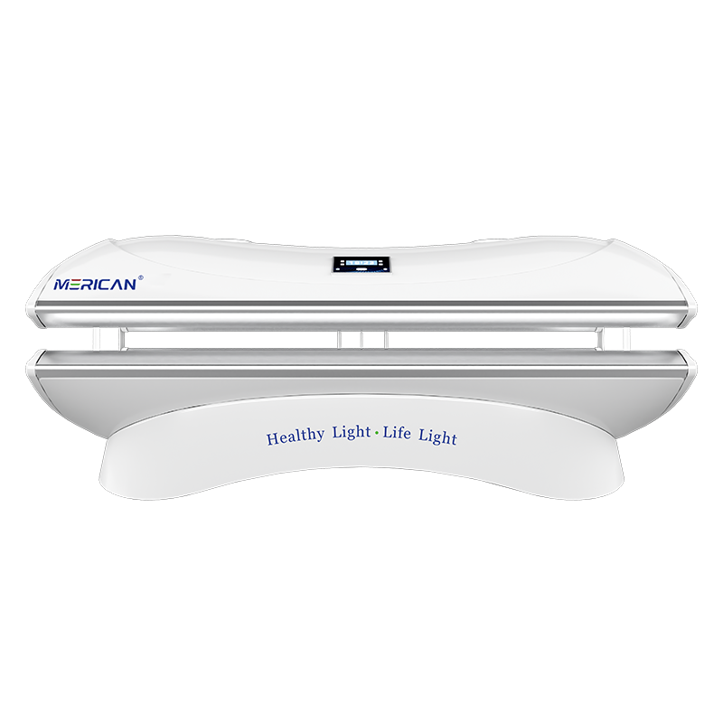
Um das Image der Merican Group besser zur Geltung zu bringen und den Einfluss und die Bekanntheit der Marke der Gruppe weiter zu steigern, Merican hat kürzlich offiziell ein neues Logo eingeführt, Das ist nicht nur ein Meilenstein für die Markenaufwertung, sondern bedeutet auch, dass Merican in eine neue Phase der globalen strategischen Entwicklung eingetreten ist!
Neues Merican-Logo| Den Kern des Unternehmens vermitteln
Das neue LOGO von Merican trägt nicht nur den Geist der Unternehmenskultur der Vergangenheit in sich 16 Jahre kaufmännische Praxis, sondern zeigt auch Mericans unermüdliches Streben nach zukünftiger wissenschaftlicher und technologischer Erforschung und Leidenschaft für Innovation, sowie sein Engagement, ein führender internationaler Kosmetik- und Gesundheitskonzern zu werden, Stärkung der Globalisierung von Wissenschaft und Technologie für ein gesundes und besseres Leben.
{ Interpretation des Wertversprechens von “Schönheit und Gesundheit”. }
Im Vergleich zur alten Version des Logos, Die neue Version des Logos behält den ursprünglichen typografischen Stil bei, und das Gesamtdesign ist durch abgerundete und flache Schriftarten optimiert, Das ist energischer und vermittelt das ästhetische Gefühl von Steifheit und Flexibilität; das Schriftartelement von “MERICAN” wird oben platziert, das MERICANs Wertversprechen der Gestaltung anschaulich interpretiert “Schönheit und Gesundheit”. –Gesundheit ist das Wichtigste, und die Schönheit der Gesundheit ist die wahre Natur der Schönheit.
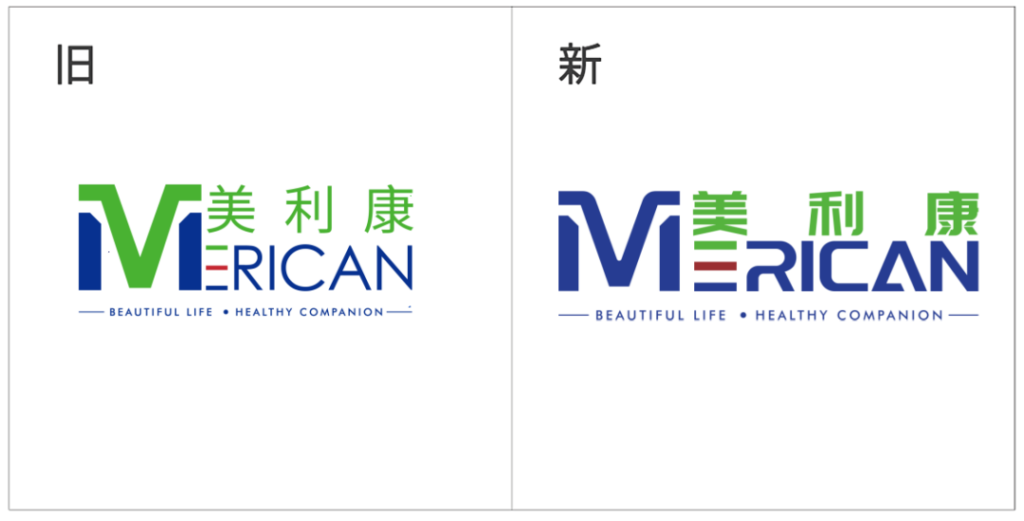
▲ Vergleich alter und neuer Logos
{ Bereitstellung der innovativen Grundlage von “Qualität zuerst”. }
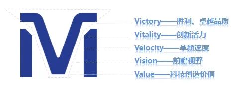
Darunter, Die “M” Symbolelement ist nicht nur der Anfangsbuchstabe von Mericom, sondern vereint auch die Farben in der Form eines Berggipfels, Dies bedeutet, dass die Qualität von Mericom genauso stabil und zuverlässig ist wie die der sanften Berggipfel.
Gleichzeitig, Der dynamische Schnitt des Symbols verleiht ihm eine Verbindung zwischen “M” Und “V”, was den Sieg symbolisiert, überlegene Qualität (Sieg), innovative Vitalität (Vitalität), Innovationsgeschwindigkeit (Geschwindigkeit), zukunftsweisende Vision (Vision), and science and technology to create value (Wert), und so weiter, and represents the leading position of Mericom in the field of scientific research and the firm belief in scientific research and discovery. Vitalität
{ Conveying the core concept of ‘People First’.}
Der “R” Und “A” symbols have also been redefined. Der “R” is derived from the shape of the Chinese character “人” in the seal script, which strongly conveys Miracon’s development philosophy of “people-oriented”. Der “R” is also broken to express Miracon’s innovative spirit of constantly surpassing itself and daring to make breakthroughs in the course of development.
Gleichzeitig, “R” can be broken down into 2 n’s, which means n times, implying the unlimited possibilities of Mericom in the future, and the concept of Mericom becoming stronger and stronger as a comprehensive enterprise group spanning the fields of beauty, Gesundheit, medical care, sports and other diversified industries.
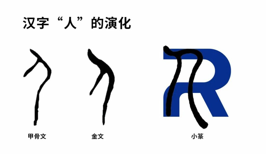
The shape of “A” is like a refracted ray of light slowly rising upwards, representing light energy and reflecting the brand attributes and positioning of Mericom. Gleichzeitig, like the immortal pyramid, it symbolizes the tough, stable and upward attitude of Mericom, and also shows that Mericom always protects every customer’s trust with safe and stable products and professional services.
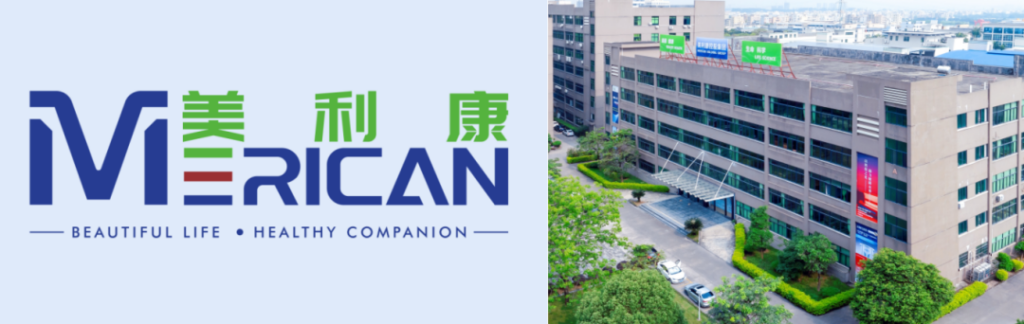
{ To demonstrate our mission of “Illuminating Beauty and Health”.}
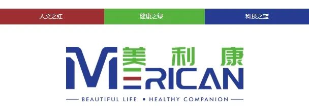
Merican’s new logo inherits the original intention and continues the original highly recognizable three primary colors of the brand: Grün, which represents the vitality of health; Rot, which signifies light and hope; and blue, which symbolizes vitality and innovation, science and technology. Jedoch, the difference is that the new logo is based on the color blue, which fully demonstrates to the outside world that Merican is transforming into a brand with the mission of “Illuminating the light of science and technology, Aufschlussreiche Schönheit und Gesundheit”.
Merikan officially opens a new era of branding | Creating a new brand matrix
Since its establishment in 2008, Merican has been upholding practice and innovation, and constantly shaping its brand. It has formed a stable foundation and system in the fields of R&D, Herstellung, marketing and service from machine to peripherals, and its brands are well loved by customers at home and abroad. The release of the new LOGO will open a brand new era for Merican ‘s brand strategy.
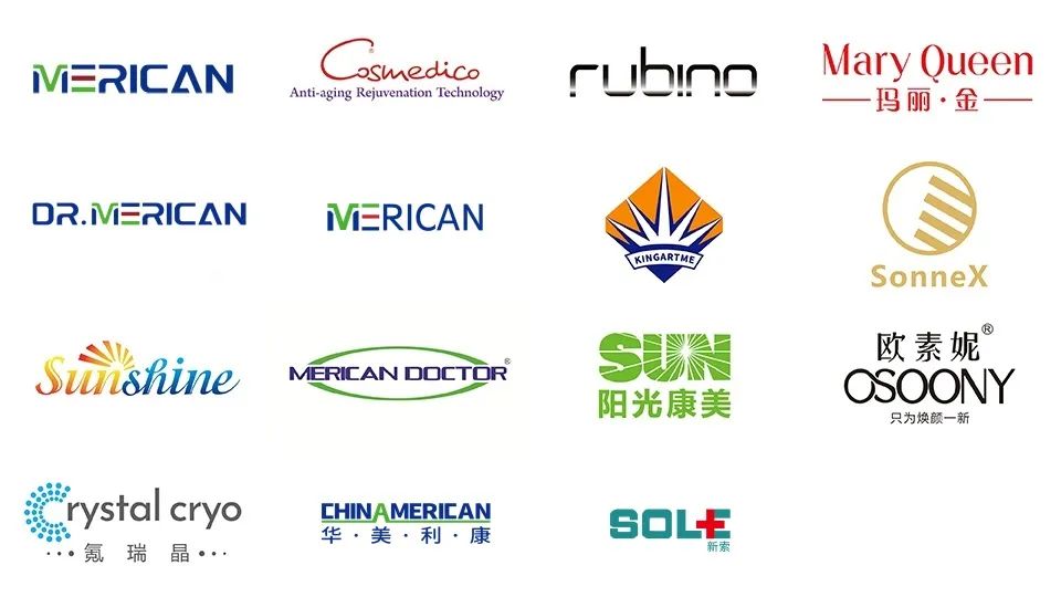
As a brand-new technology brand, the new Merican LOGO will be extended to various fields such as enterprise application and brand culture construction, providing users with better quality products and services and creating more value for customers.