메리칸 그룹의 이미지를 더 잘 표현하고 그룹 브랜드의 영향력과 인지도를 더욱 높이기 위해, Merican은 최근 공식적으로 새로운 로고를 출시했습니다., 이는 획기적인 브랜드 업그레이드일 뿐만 아니라, 이는 메리칸이 글로벌 전략 발전의 새로운 단계에 들어섰다는 의미이기도 합니다.!

메리칸의 새로운 로고| Conveying the core of the company
Merican’s new LOGO not only carries the distillation of the spirit of corporate culture from the past 16 years of business practice, but also demonstrates Merican’s relentless pursuit of future scientific and technological exploration and passion for innovation, as well as its commitment to becoming a top international beauty and health industry group, empowering globalization of science and technology for healthy and better life.
{ Interpretation of the value proposition of “beauty and health”. }
Compared with the old version of the logo, the new version of the logo retains the original typographic style, and the overall design is optimized with rounded and flat fonts, which is more energetic and presents the aesthetic sense of both rigidity and flexibility; the font element of “메리칸” is placed on the top, which vividly interprets MERICAN’s value proposition of shaping “beauty and health”. –Health is the most important thing, and the beauty of health is the true nature of beauty.
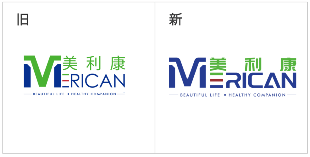
▲ Comparison of old and new logos
{ Delivering the innovative foundation of “Quality First”. }
Among them, 그만큼 “M” symbol element is not only the initial letter of Mericom, but also unifies the colors in the shape of a mountain peak, implying that the quality of Mericom is as stable and reliable as the rolling mountain peaks.
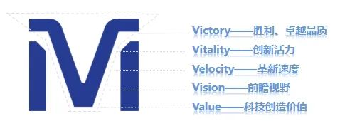
동시에, the dynamic cut of the symbol gives it a link between “M” 그리고 “다섯”, which symbolizes victory, superior quality (Victory), innovative vitality (Vitality), innovative speed (Velocity), forward-looking vision (비전), and science and technology to create value (Value), 등, and represents the leading position of Mericom in the field of scientific research and the firm belief in scientific research and discovery. Vitality
{ Conveying the core concept of ‘People First’.}
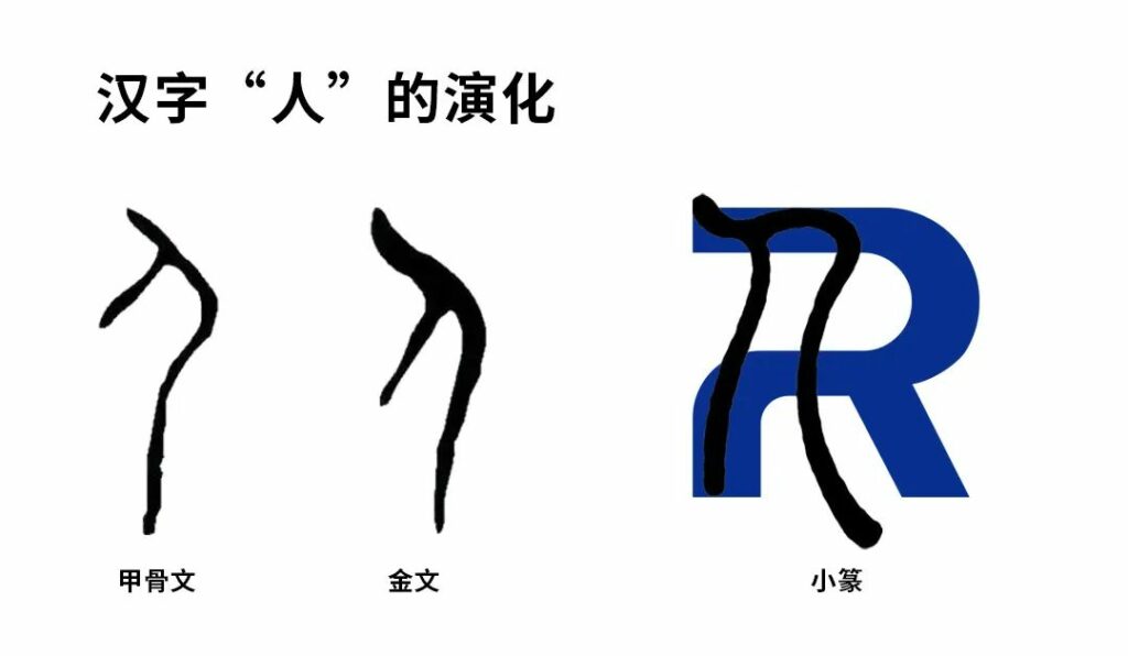
그만큼 “아르 자형” 그리고 “에이” symbols have also been redefined. 그만큼 “아르 자형” is derived from the shape of the Chinese character “人” in the seal script, which strongly conveys Miracon’s development philosophy of “people-oriented”. 그만큼 “아르 자형” is also broken to express Miracon’s innovative spirit of constantly surpassing itself and daring to make breakthroughs in the course of development.
동시에, “아르 자형” can be broken down into 2 n’s, which means n times, implying the unlimited possibilities of Mericom in the future, and the concept of Mericom becoming stronger and stronger as a comprehensive enterprise group spanning the fields of beauty, 건강, medical care, sports and other diversified industries.
The shape of “에이” is like a refracted ray of light slowly rising upwards, representing light energy and reflecting the brand attributes and positioning of Mericom. 동시에, like the immortal pyramid, it symbolizes the tough, stable and upward attitude of Mericom, and also shows that Mericom always protects every customer’s trust with safe and stable products and professional services.

{ To demonstrate our mission of “Illuminating Beauty and Health”.}
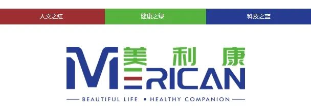
Merican’s new logo inherits the original intention and continues the original highly recognizable three primary colors of the brand: 녹색, which represents the vitality of health; 빨간색, which signifies light and hope; and blue, which symbolizes vitality and innovation, science and technology. 하지만, the difference is that the new logo is based on the color blue, which fully demonstrates to the outside world that Merican is transforming into a brand with the mission of “Illuminating the light of science and technology, 아름다움과 건강을 밝힙니다”.
메리칸 officially opens a new era of branding | Creating a new brand matrix
Since its establishment in 2008, Merican has been upholding practice and innovation, and constantly shaping its brand. It has formed a stable foundation and system in the fields of R&디, manufacturing, marketing and service from machine to peripherals, and its brands are well loved by customers at home and abroad. The release of the new LOGO will open a brand new era for Merican ‘s brand strategy.
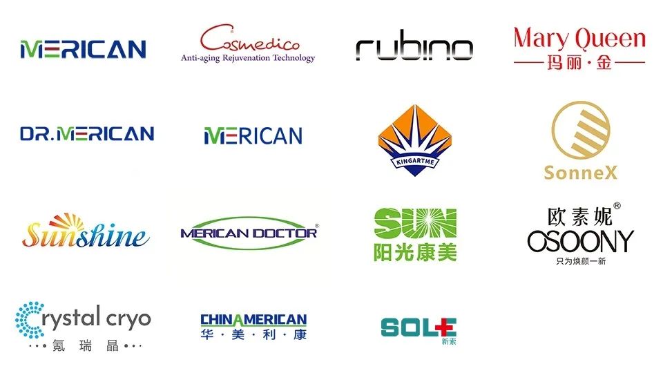
As a brand-new technology brand, the new Merican LOGO will be extended to various fields such as enterprise application and brand culture construction, providing users with better quality products and services and creating more value for customers.


