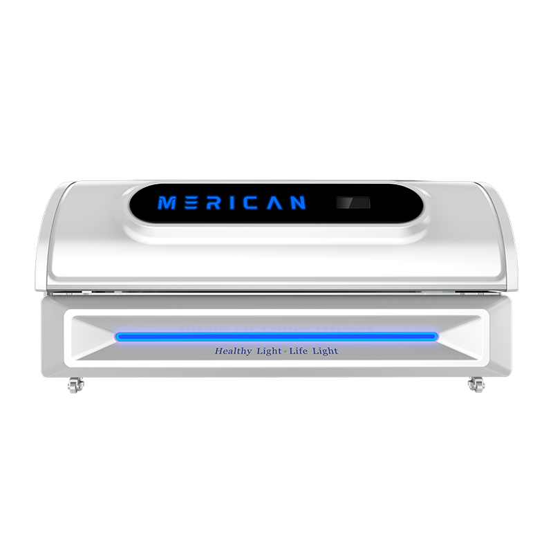
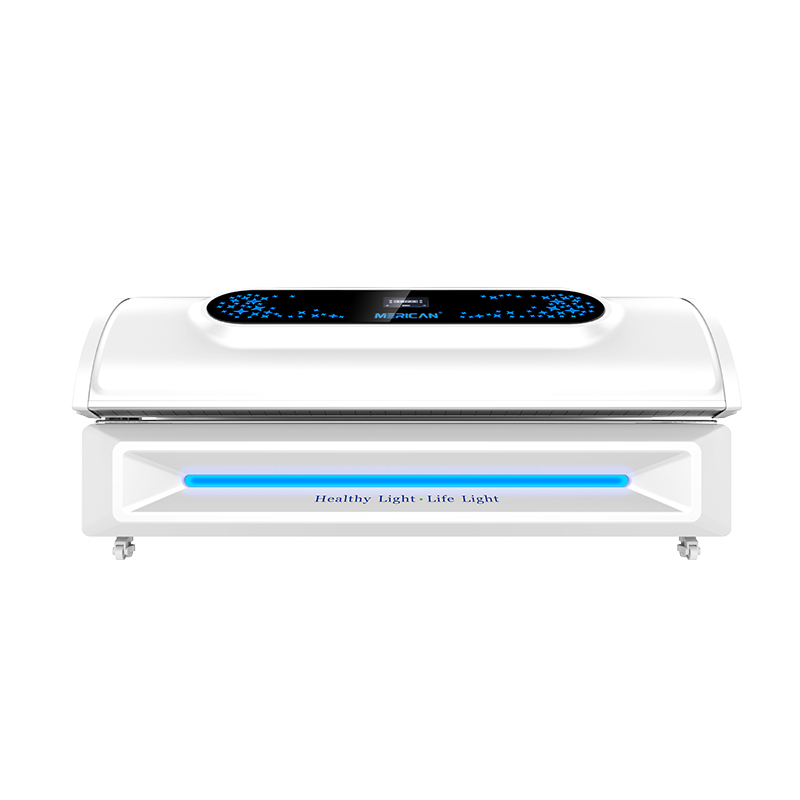
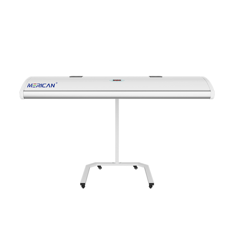
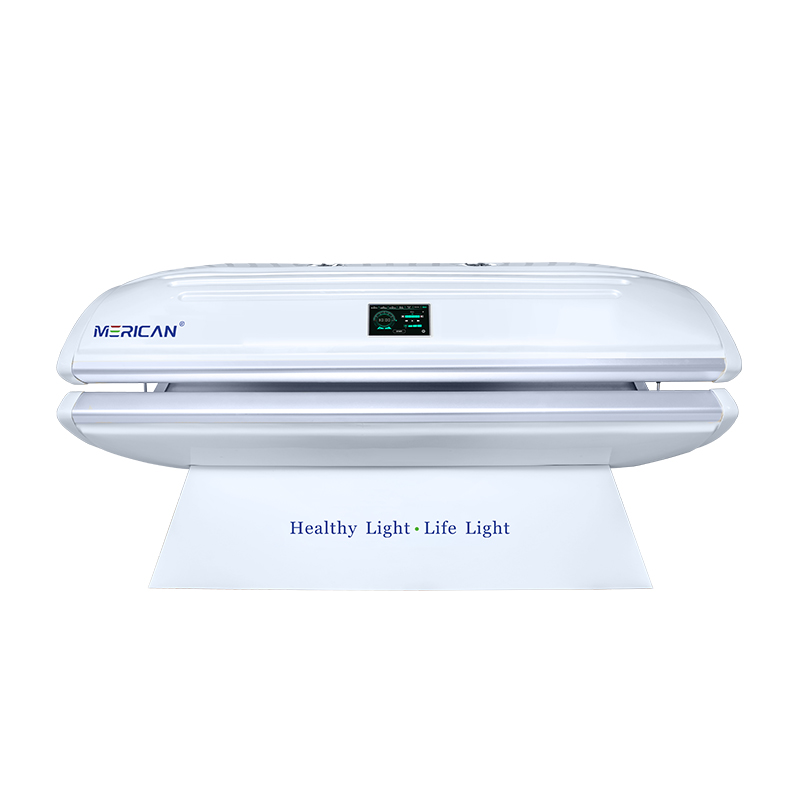
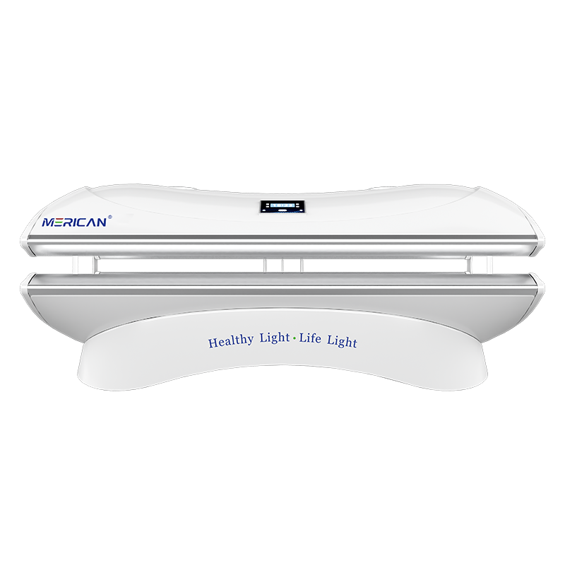
Chun íomhá Merican Group a thaispeáint níos fearr agus tionchar agus aitheantas bhranda an Ghrúpa a fheabhsú tuilleadh, Sheol Merican lógó nua go hoifigiúil le déanaí, nach bhfuil ann ach uasghrádú branda cloch mhíle, ach léiríonn sé freisin go bhfuil Merican tar éis céim nua a bhaint amach i bhforbairt straitéiseach domhanda!

Lógó nua Mheiriceá| Croílár na cuideachta a iompar
Ní hamháin go n-iompraíonn LOGO nua Merican driogadh spiorad an chultúir chorparáidigh ón am atá thart 16 blianta de chleachtadh gnó, ach léiríonn sé freisin an tóir gan staonadh atá ag Merican ar thaiscéalaíocht eolaíoch agus teicneolaíochta sa todhchaí agus paisean don nuálaíocht, chomh maith lena thiomantas do bheith ar an ngrúpa idirnáisiúnta is fearr sa tionscal áilleachta agus sláinte, domhandú na heolaíochta agus na teicneolaíochta a chumhachtú le haghaidh saol sláintiúil agus níos fearr.
{ Léiriú ar thairiscint luacha “áilleacht agus sláinte”. }
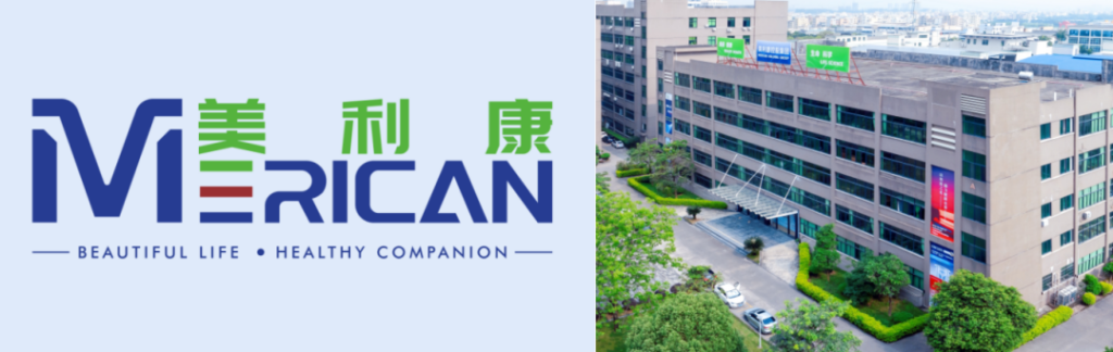
I gcomparáid leis an seanleagan den lógó, coinníonn an leagan nua den lógó an stíl clóghrafach bhunaidh, agus tá an dearadh foriomlán optamaithe le clónna cruinn agus cothrom, atá níos fuinniúla agus a chuireann braistint aeistéitiúil na dochta agus na solúbthachta i láthair; an eilimint chló de “MERCACH” a chuirtear ar an mbarr, a léirmhíníonn go beoga luach MERICAN tairiscint mhúnlaithe “áilleacht agus sláinte”. –Is é an tsláinte an rud is tábhachtaí, agus is í áilleacht na sláinte fíor-nádúr na háilleachta.
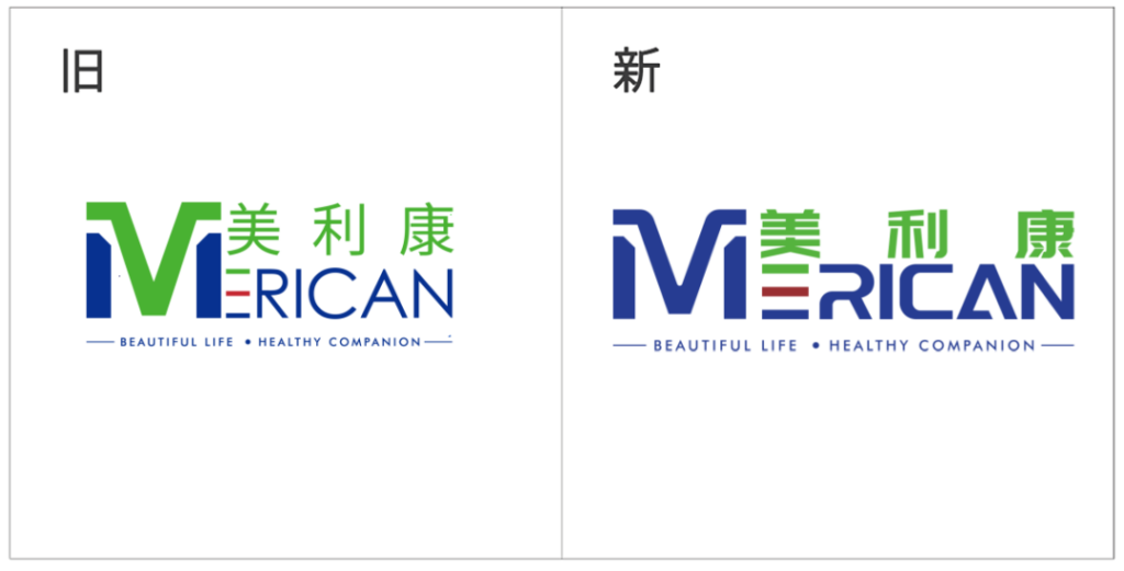
▲ Comparáid idir lógónna sean agus nua
{ Bunús nuálaíoch na “Cáilíocht Ar dtús”. }
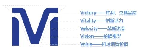
Ina measc, an “M” Ní hamháin gur litir tosaigh Mericom í an eilimint shiombail, ach freisin unifies na dathanna i gcruth buaic sléibhe, rud a thugann le tuiscint go bhfuil cáilíocht Mericom chomh cobhsaí agus chomh hiontaofa leis na beanna sléibhe rollta.
Ag an am céanna, tugann gearrtha dinimiciúil na siombaile nasc dó idir “M” agus “V”, rud a shamhlaíonn bua, caighdeán níos fearr (bua), beogacht nuálaíoch (bheocht), luas nuálaíoch (Treoluas), fís chun cinn (Fís), and science and technology to create value (Value), agus mar sin de, and represents the leading position of Mericom in the field of scientific research and the firm belief in scientific research and discovery. bheocht
{ Conveying the core concept of ‘People First’.}
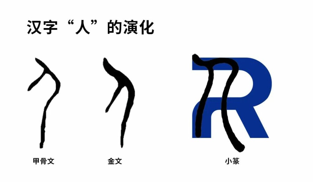
Tá an “R” agus “A” symbols have also been redefined. Tá an “R” is derived from the shape of the Chinese character “人” in the seal script, which strongly conveys Miracon’s development philosophy of “people-oriented”. Tá an “R” is also broken to express Miracon’s innovative spirit of constantly surpassing itself and daring to make breakthroughs in the course of development.
Ag an am céanna, “R” can be broken down into 2 n’s, which means n times, implying the unlimited possibilities of Mericom in the future, and the concept of Mericom becoming stronger and stronger as a comprehensive enterprise group spanning the fields of beauty, sláinte, medical care, sports and other diversified industries.
The shape of “A” is like a refracted ray of light slowly rising upwards, representing light energy and reflecting the brand attributes and positioning of Mericom. Ag an am céanna, like the immortal pyramid, it symbolizes the tough, stable and upward attitude of Mericom, and also shows that Mericom always protects every customer’s trust with safe and stable products and professional services.
{ To demonstrate our mission of “Illuminating Beauty and Health”.}
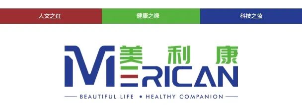
Merican’s new logo inherits the original intention and continues the original highly recognizable three primary colors of the brand: glas, which represents the vitality of health; dearg, which signifies light and hope; and blue, which symbolizes vitality and innovation, science and technology. Mar sin féin, the difference is that the new logo is based on the color blue, which fully demonstrates to the outside world that Merican is transforming into a brand with the mission of “Illuminating the light of science and technology, ag soilsiú áilleacht agus sláinte”.
meiriceánach officially opens a new era of branding | Creating a new brand matrix
Since its establishment in 2008, Merican has been upholding practice and innovation, and constantly shaping its brand. It has formed a stable foundation and system in the fields of R&D, déantúsaíocht, marketing and service from machine to peripherals, and its brands are well loved by customers at home and abroad. The release of the new LOGO will open a brand new era for Merican ‘s brand strategy.
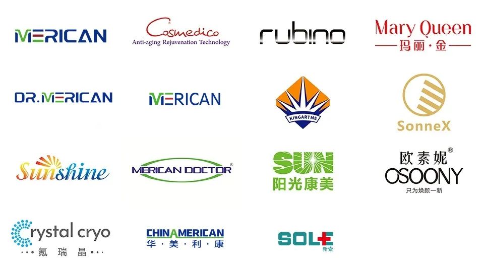
As a brand-new technology brand, the new Merican LOGO will be extended to various fields such as enterprise application and brand culture construction, providing users with better quality products and services and creating more value for customers.